
Getting there fast
February 22 2021 — UI/UX Design for IBM
Applying to be a product design intern at IBM starts with a four-day design sprint. My project was on the rental car company called Hertz. A prompt arrived in my inbox on a Monday and, by Friday of that week, I had put together a UX audit and a series of new, high-resolution, animated interfaces for the Hertz iOS app.
PROMPT
A mid-career professional who occasionally travels for work needs a better way to find just the right vehicle when using the Hertz mobile app.
01
Research
Most UX projects start with days of research and interviews—learning about what I’m designing, and who I’m designing for. With just four days for this sprint, I condensed that discovery phase into an internet deep dive. I made notes of values, traits, and needs that defined my product and user, and recorded the kinds of questions that I’d ask if I had more time.
I was 20 years old at this point, had never rented a car, and was far from a “mid-career professional.” But empathy is mandatory, and I’d need to educate myself until I had it.

What is our brand?

Who is our user?

Key Insights
-
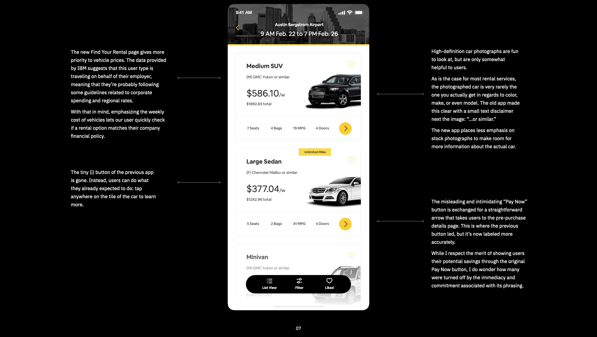
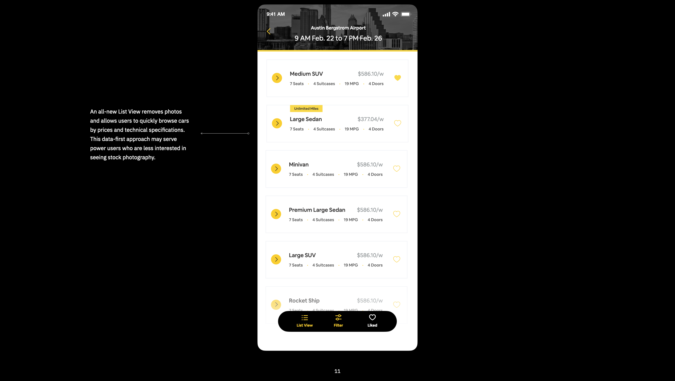
According to IBM’s research, this user type values having lots of information and control over the car they ultimately choose to reserve. As one user put it, “I just want to browse and understand my options.” Rather than opacity or hand-holding, we’ll emphasize information and agency.
-
This user type is experienced with renting cars. They do it all the time for their business trips, and deserve an app that remembers their preferences and respects their knowledge.
Those business trips among Hertz users are, on average, 3 days long and paid for by their employers. Employers have guidelines related to rental spending based on location assumption, so our user has certain criteria to meet when purchasing. Cars that meet those criteria should be placed front and center.
-
The largest share (31%) of Hertz users are 30 to 49 years-old, which aligns with the average age of mid-career professionals. Farsightedness affect most people over 40, so this user type may benefit from high-contrast screens and larger text.
02
Observe
Hertz already has a mobile app. After getting familiar with it, I asked an experienced car-renter, my dad, to make a reservation from his phone.* As I observed him use the app, I noted what worked, what didn’t, and kept an eye out for ergonomics and accessibility. I also reviewed apps with similar interactions such as Kayak and Turo.
*On projects with longer timescales, I’d wrangle actual users—the kind I’m not related to.
Old App Screens
(View in landscape on mobile)


03
Ideate
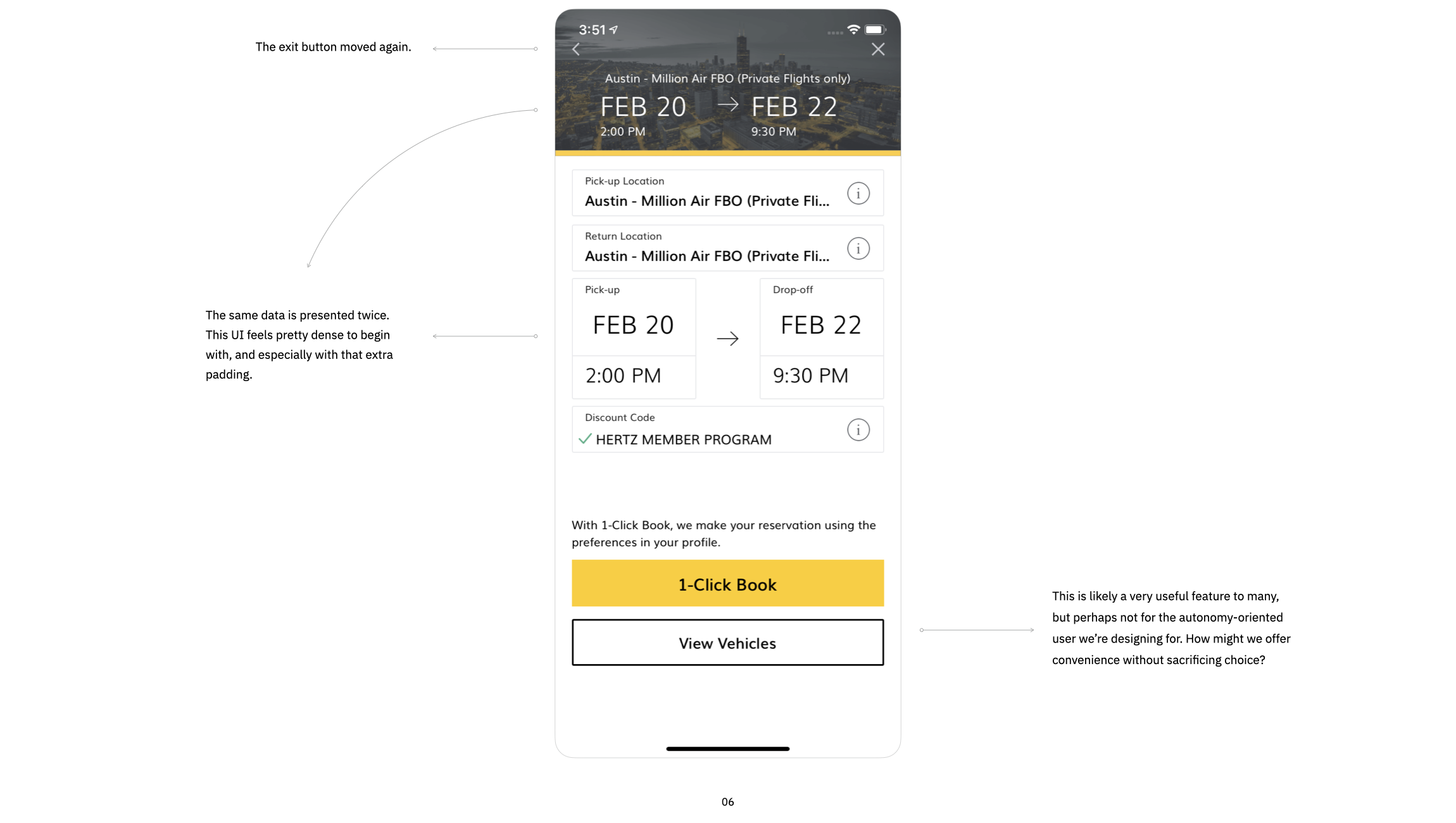
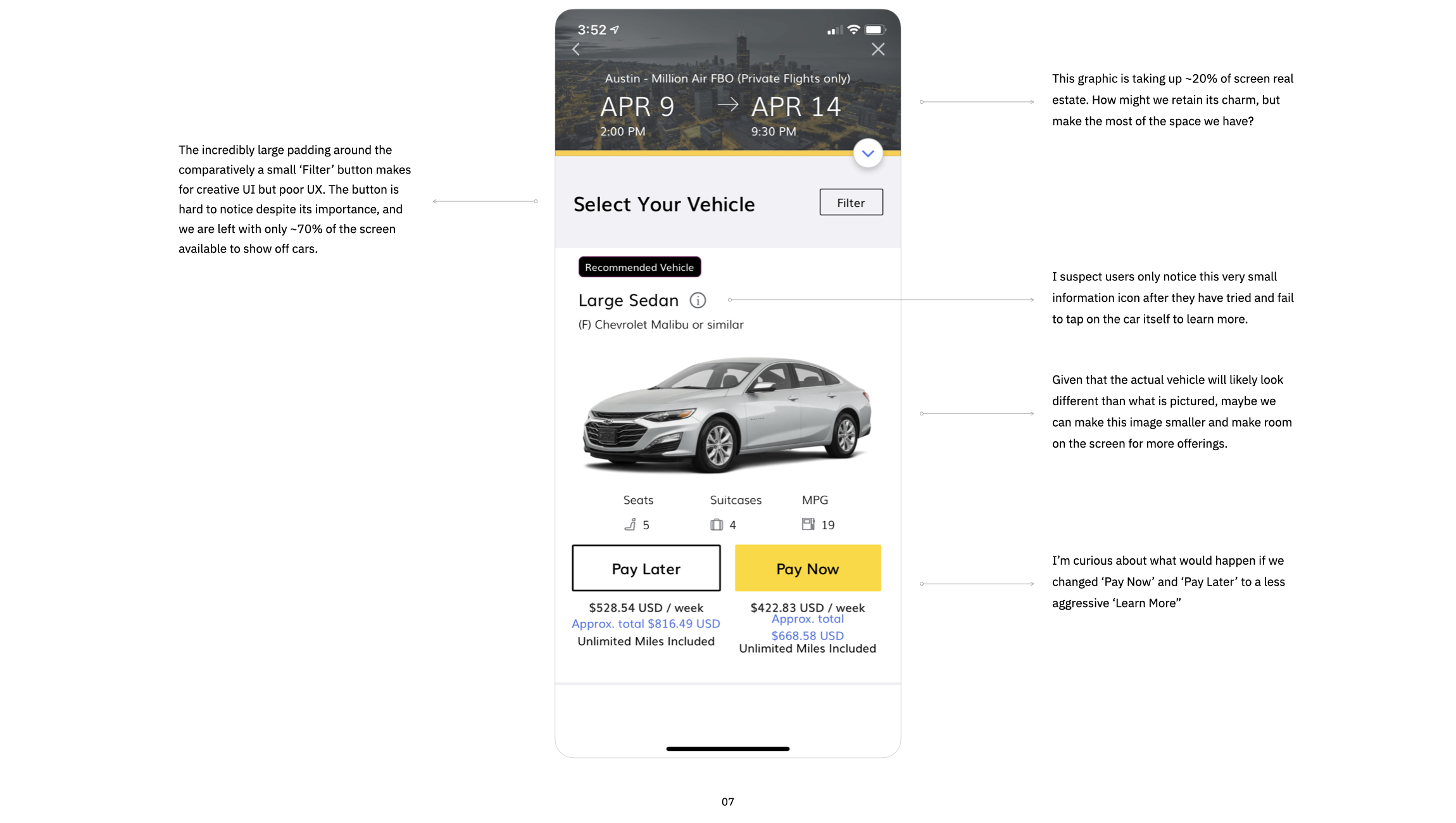
Reviewing the app revealed that a few minor changes to the UI could improve accessibility and flow. But people who rent with Hertz aren’t looking for a sleeker ‘location selection’ screen, they’re looking for a car. Two new features could get to the heart of this need, skipping unnecessary data entry and creating small moments of delight.

Flight Finder
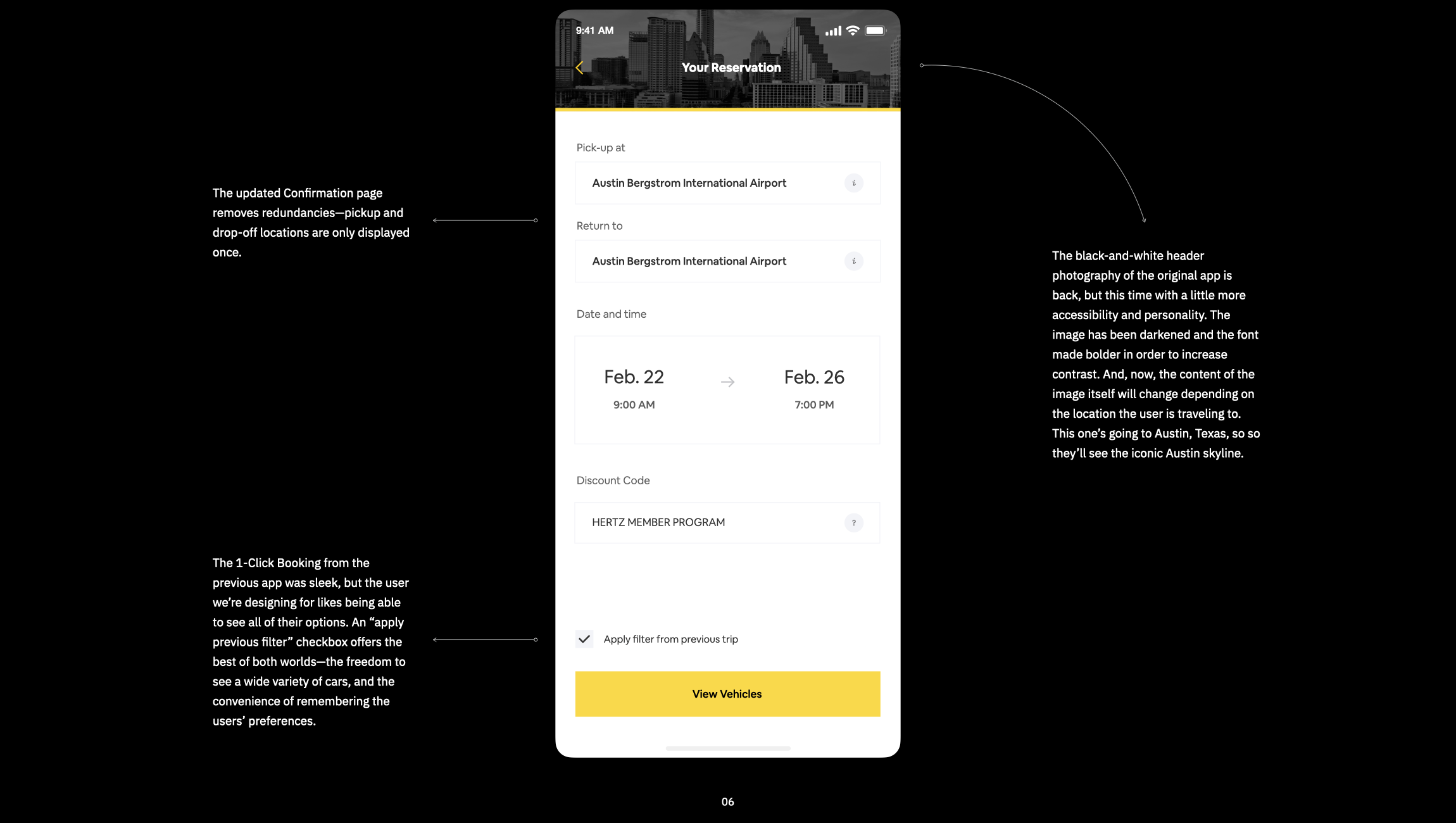
This user type is likely picking up their rental car from an airport. Instead of typing in dates and cities, they can just tell us their flight number and we’ll take care of the rest—showing them the cars that will be available when and where their plane lands.
Filter Memory
This user rents cars when traveling for work, and their employer likely has specific criteria for which prices and models match company policy. Tell Hertz those criteria just once, and we’ll remember them as an optional search filter next time they rent with us.

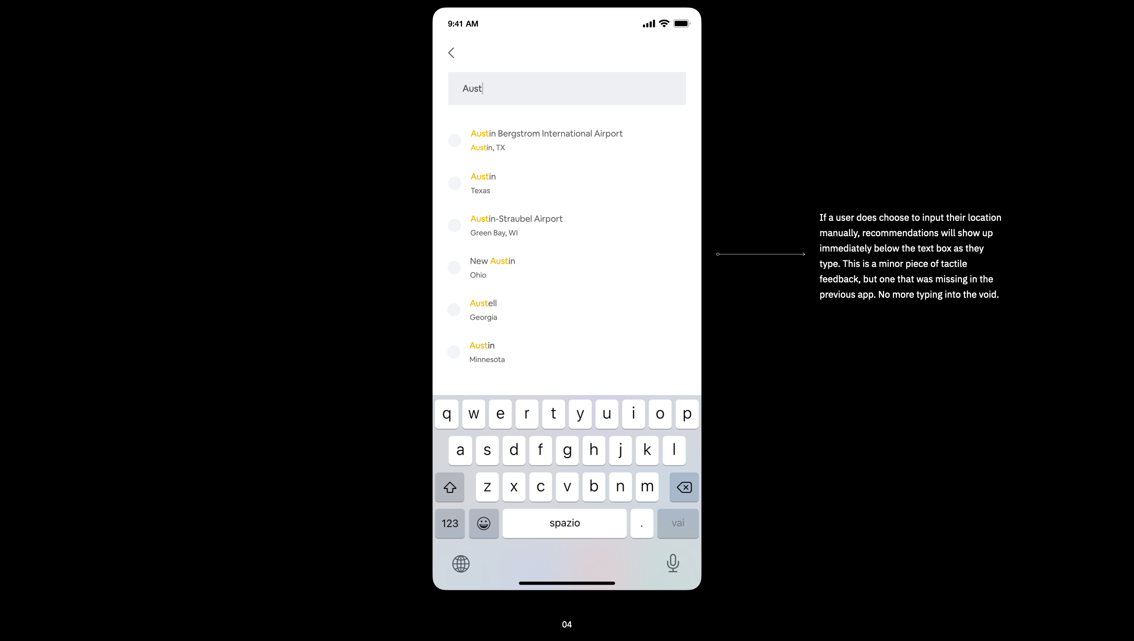
Flight Finder in action
03
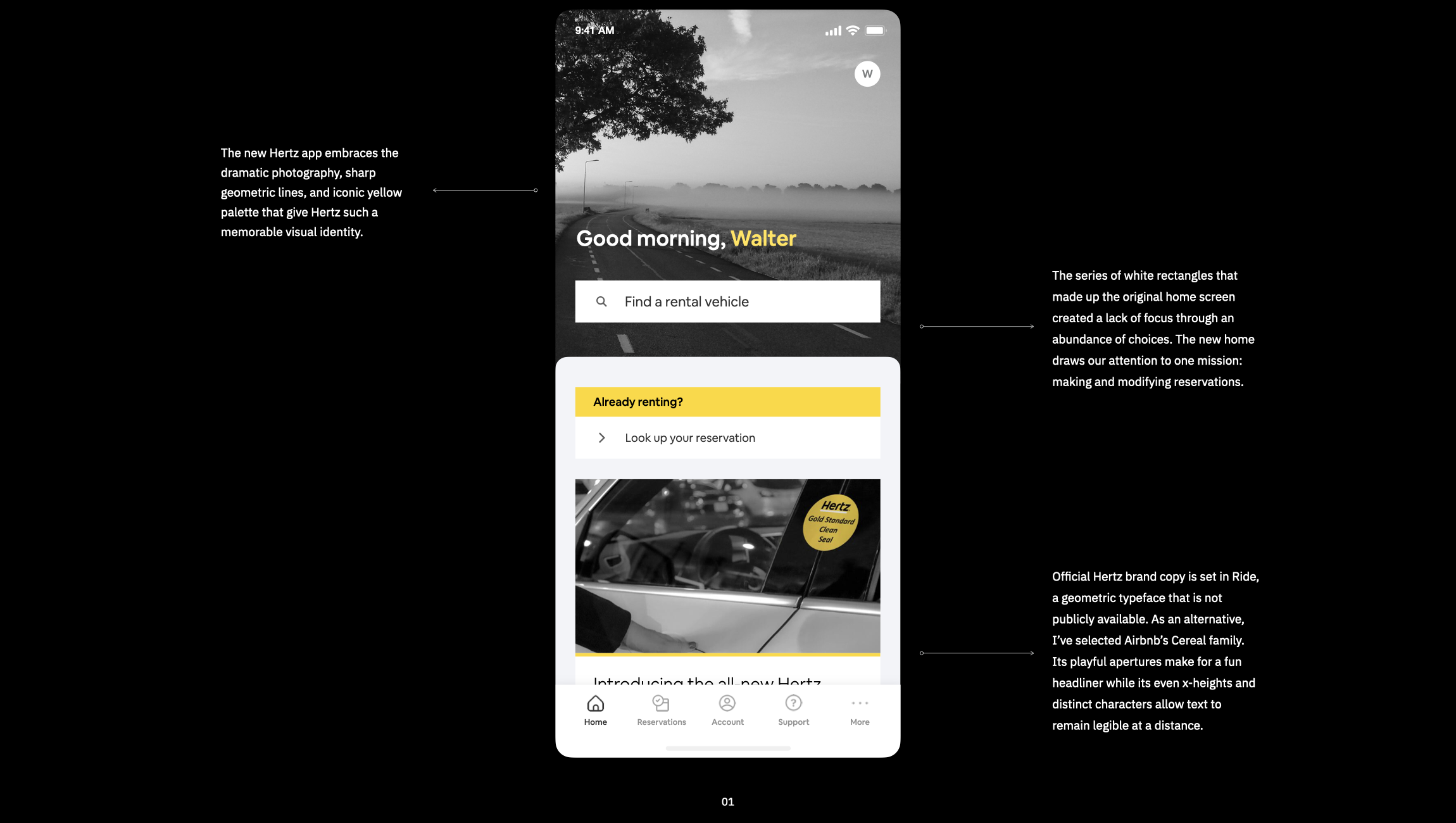
Design
The new Hertz app—accessible, tactile, empowering—puts users in the driver’s seat.
Updated App Screens
(View in landscape on mobile)


Final Thoughts
I went on to intern for, and receive a full-time offer from, IBM in the Summer of 2021. This sprint was a delightful and humbling introduction to that job.
No matter how hard we try, dandelions sprout from concrete. No matter how many times I use the word “seamless,” this project is so far from perfect. The four days I spent on this were also spent packing for college and flying across the country. Symptoms of that fact include: zero user interviews, untested assumptions, and missing icons. There’s a lot I would have liked to have done. And that’s okay. I suspect it is a mantra in this profession to wish we had just one more day.
But, until then: 90% of text in new app has a contrast ratio of 7:1 or higher to meet WCAG Level AAA accessibility requirements. Using the Flight Finder feature turns 5 taps into 1. And I learned a thing or two about rental cars.